The product
Twelve screens, one language
The home screen is a promise: every number on it opens the work behind it. These are the destinations that promise leads to.
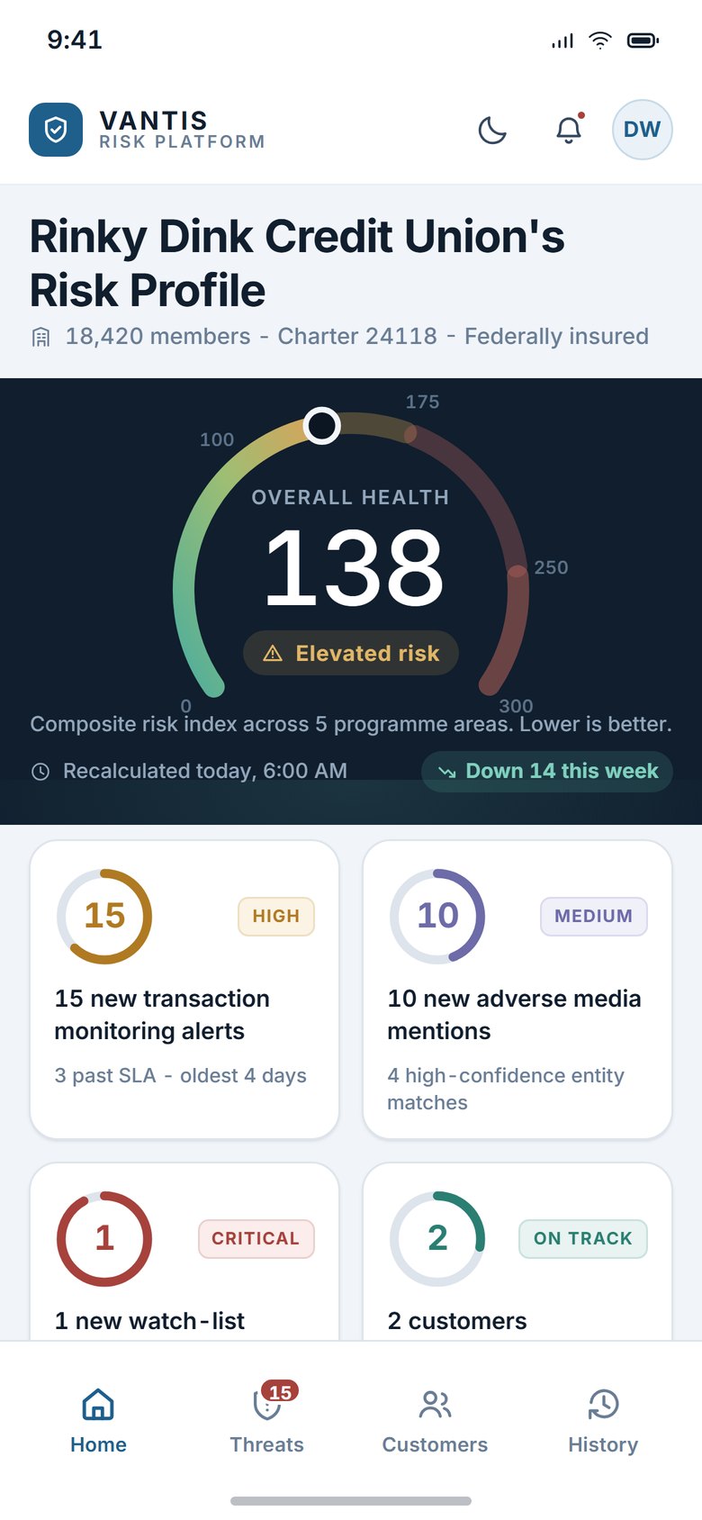
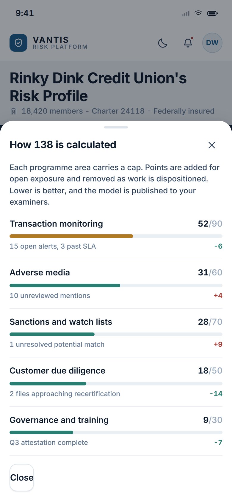
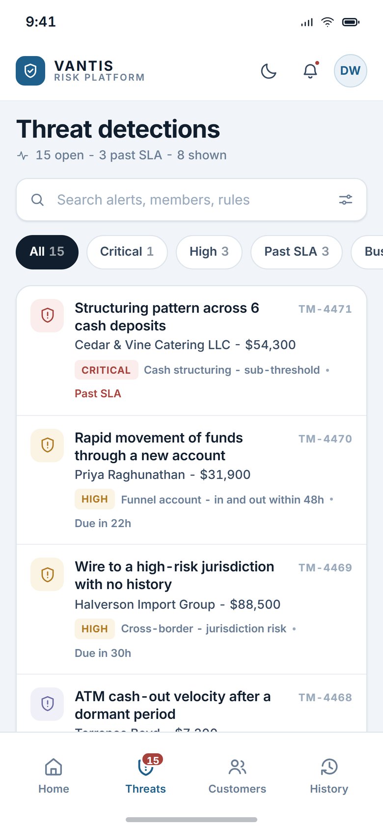
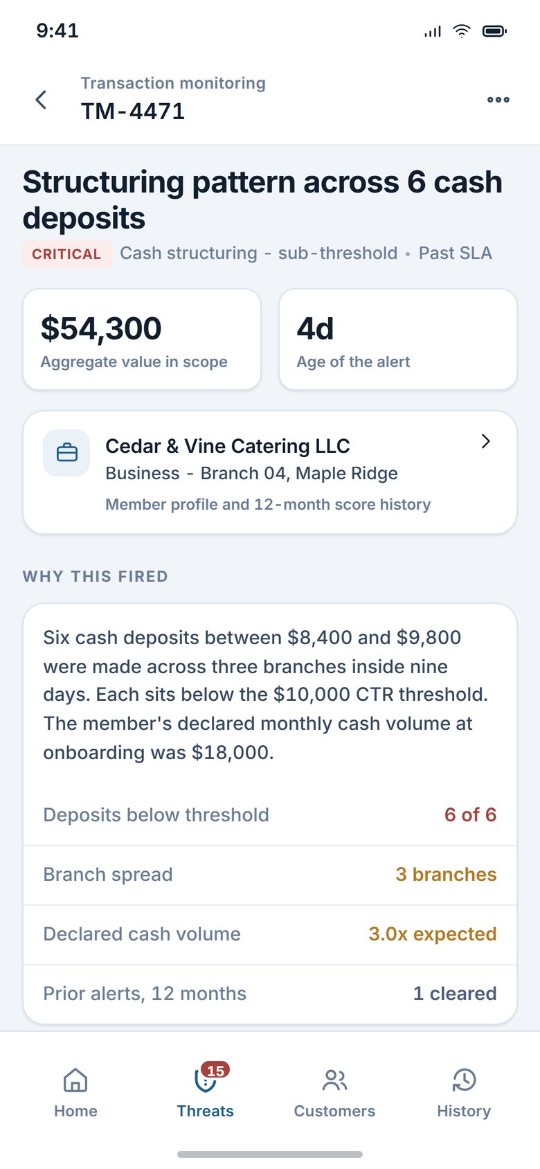
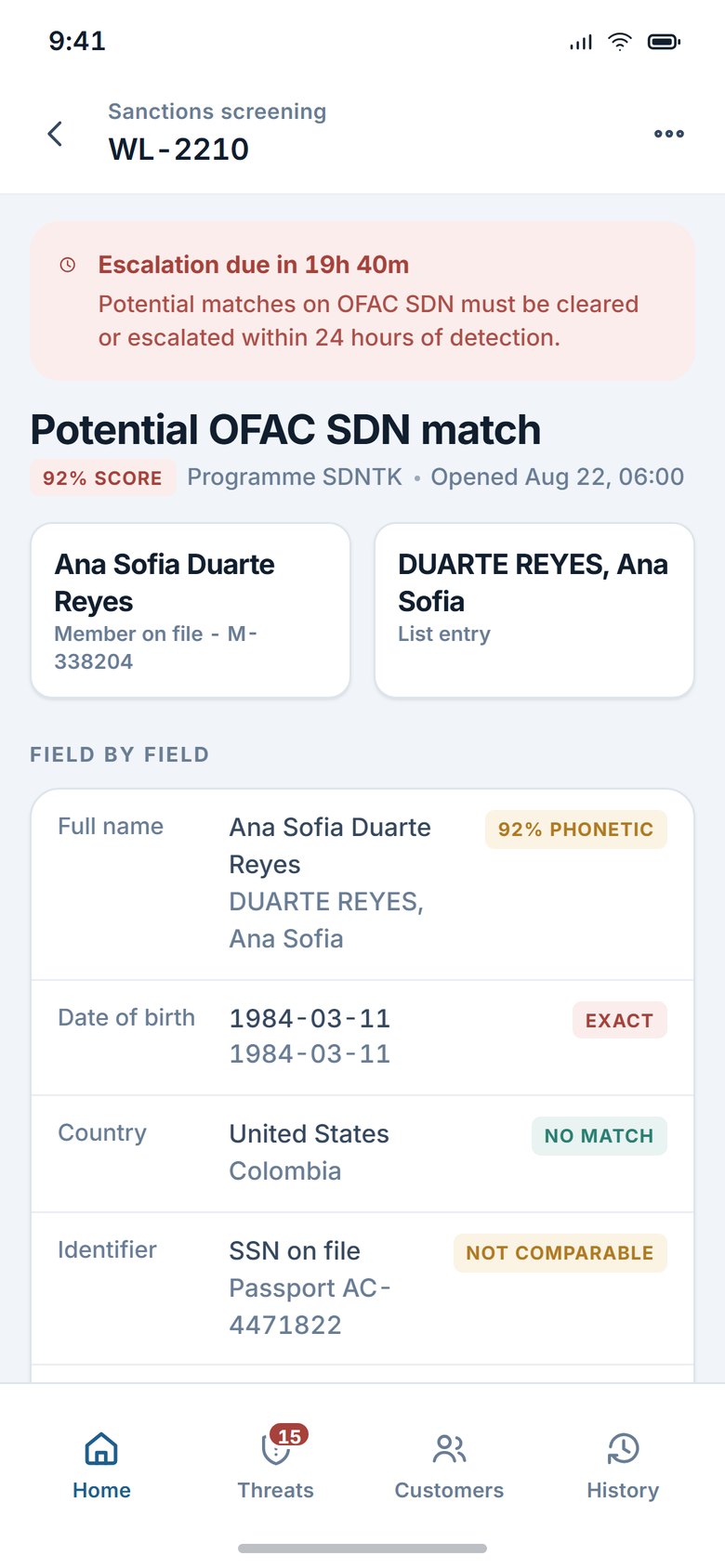
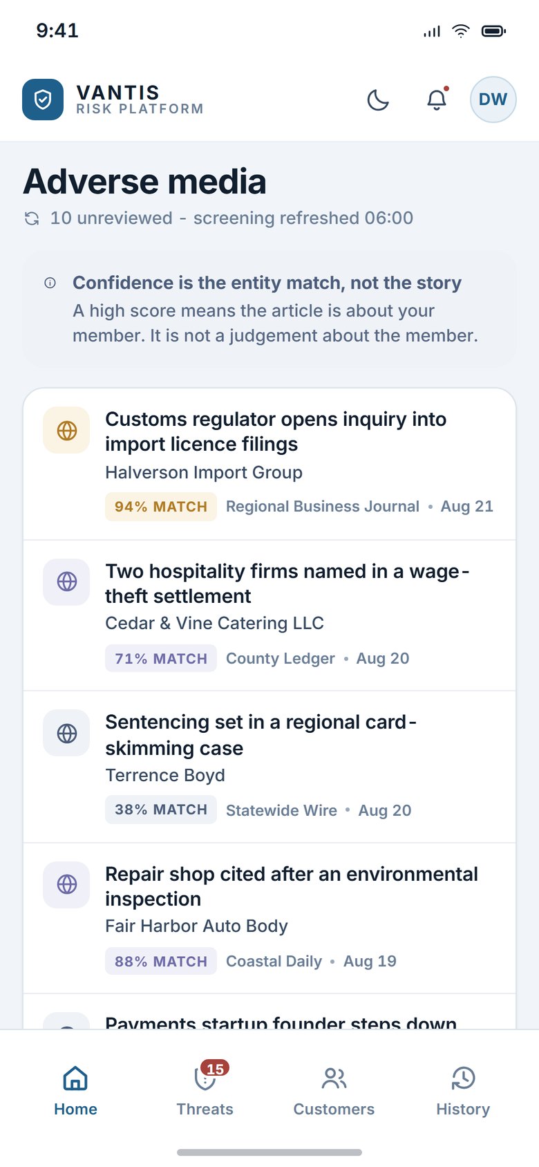
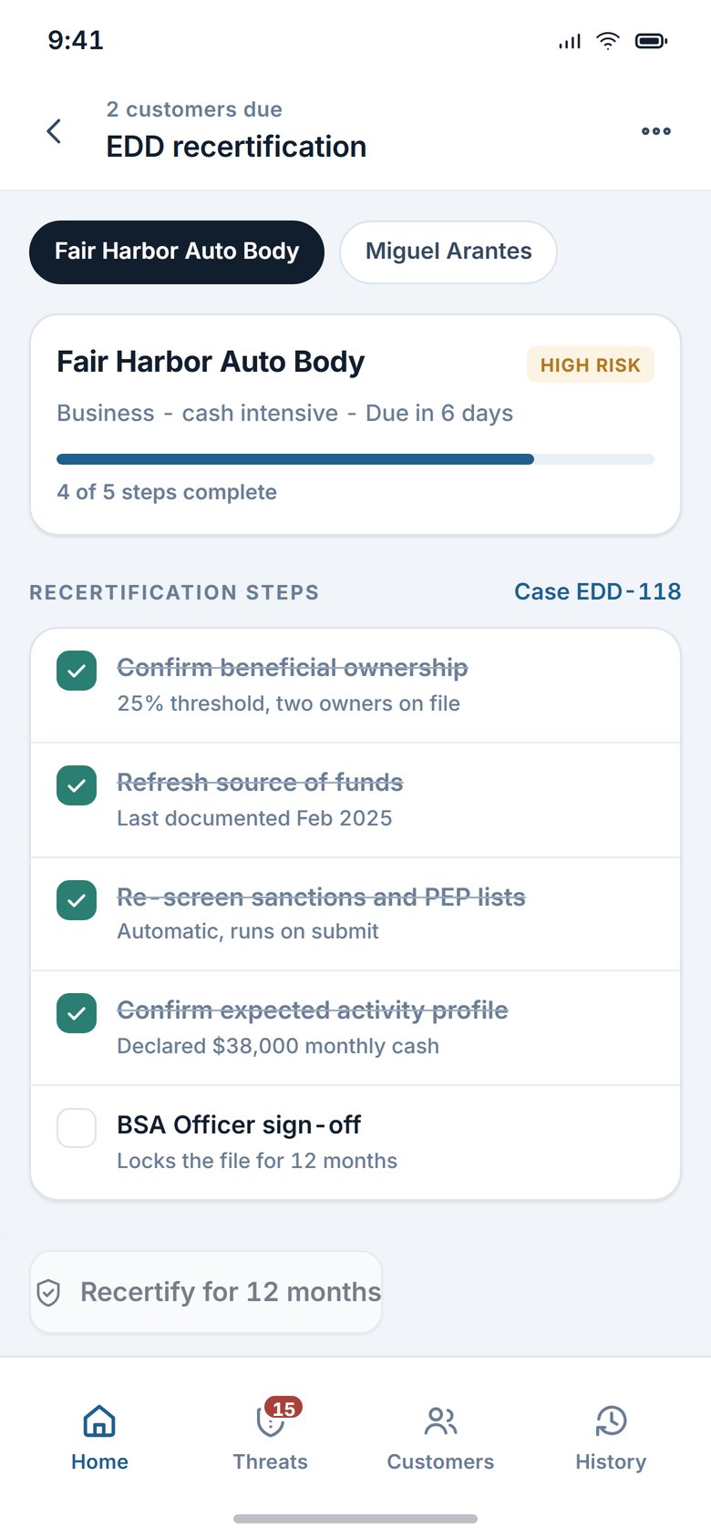
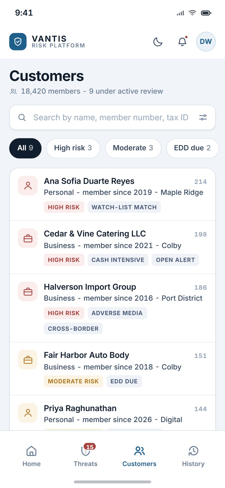
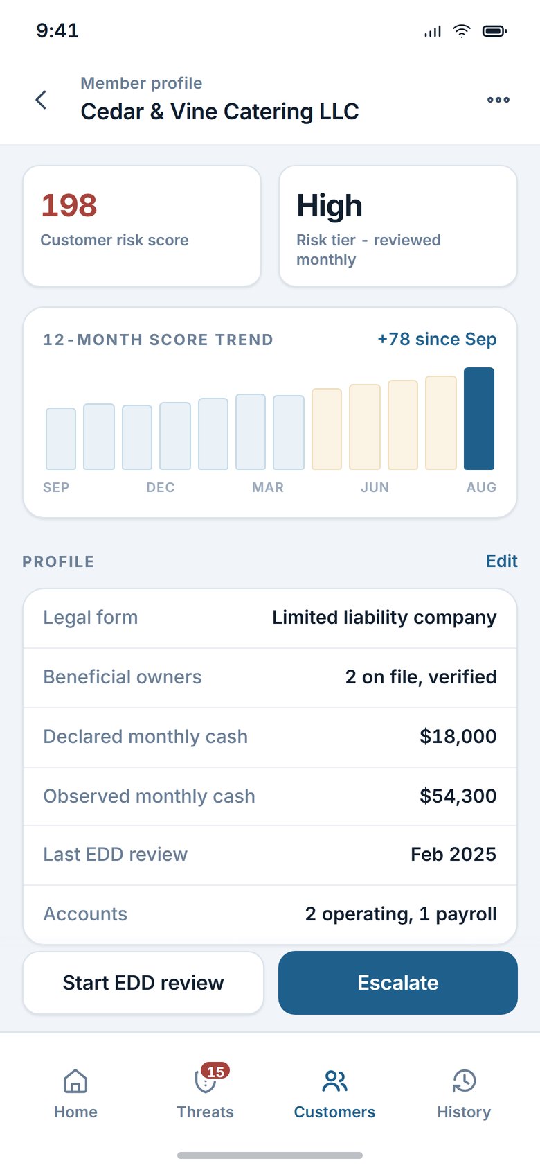
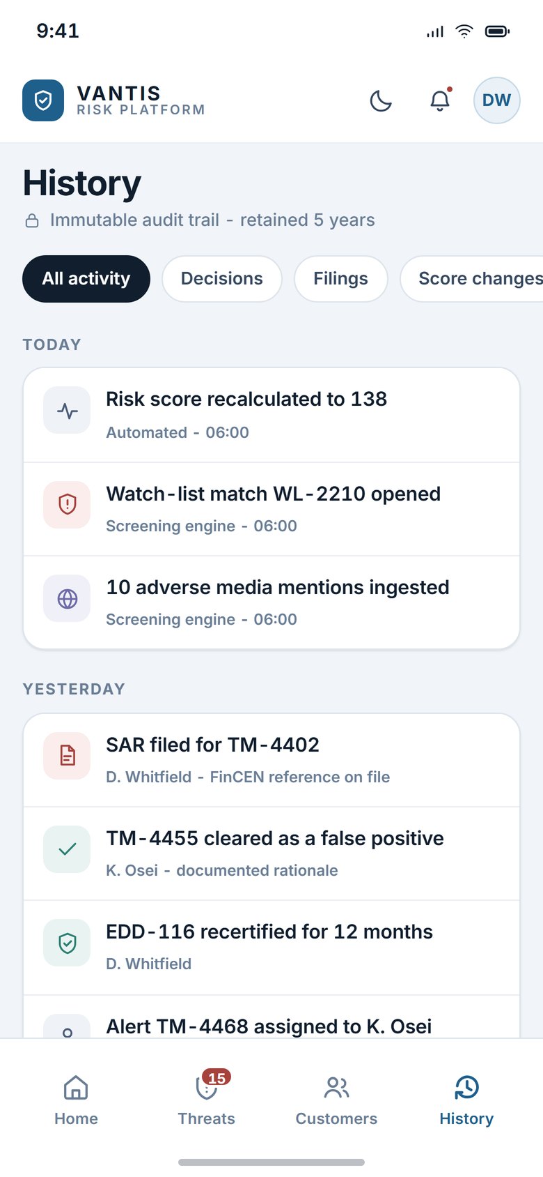
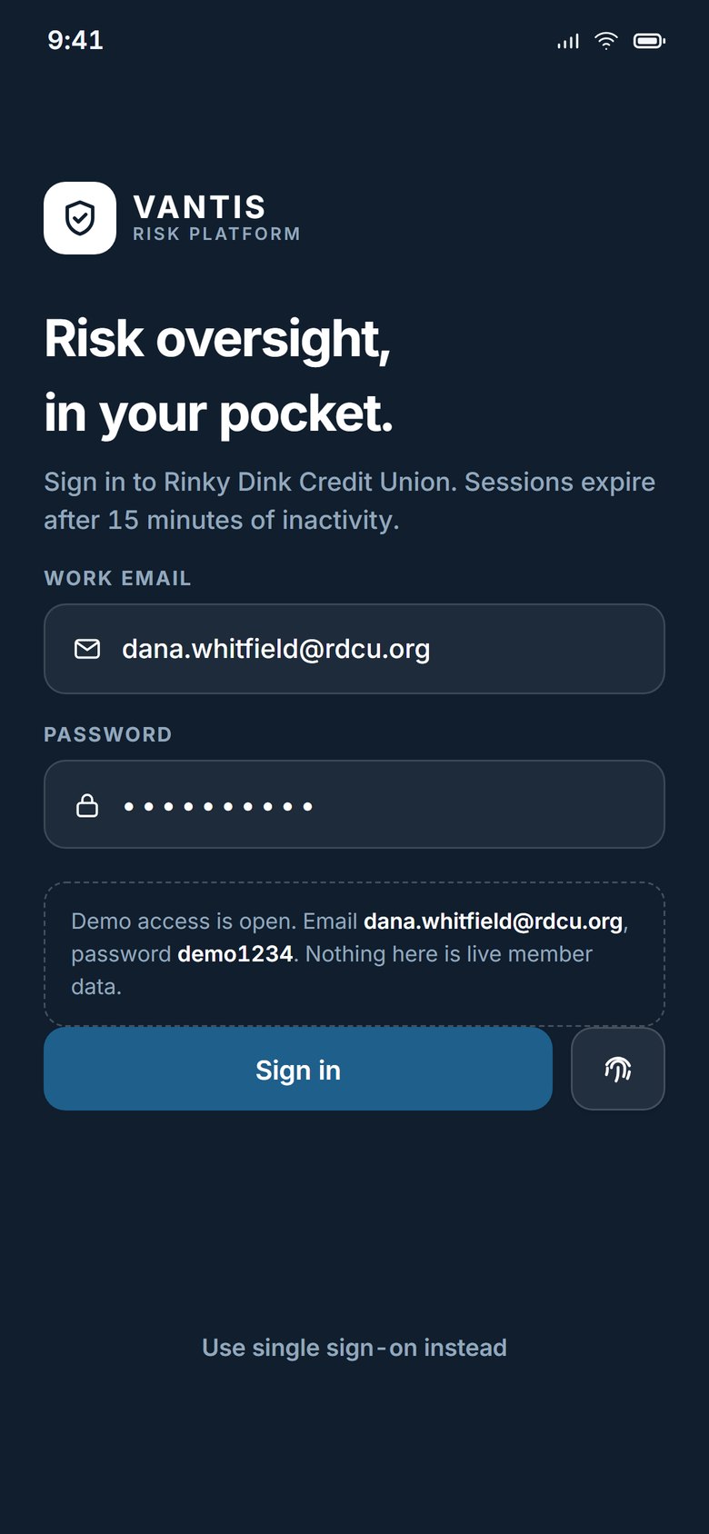
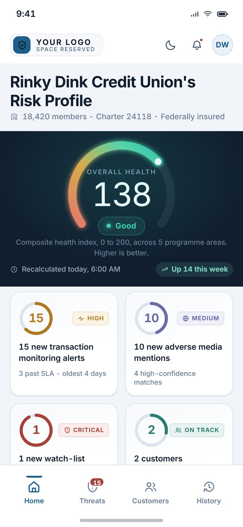
A complete design language for anti money laundering oversight: one composite score, four exposure counters, an action list that always says what to do next. Every screen on this page is a real running interface, not a picture of one. Open it on your phone and use it.
Demo sign in: dana.whitfield@northbaycu.org / demo1234. Sample data only, no real member records.
Live prototype, 390 x 844. Tap the gauge, the tiles, the action list.
Anti money laundering work in a community bank is a queue of judgement calls with deadlines attached. The interface has to say what is wrong, how bad it is, and what to do next, before the person reading it sits down.
The home screen is a promise: every number on it opens the work behind it. These are the destinations that promise leads to.
Dark is the shipping theme, for a screen read in a back office at 7am and in a car park at 7pm. Colour carries one job on it: severity. Every pair below clears WCAG AA for its use, and most clear AAA.
| Role | Size / line | Weight |
|---|---|---|
| Screen title | 25 / 29 | 700, -2.2% tracking |
| Score display | 52 / 52 | 300, tabular figures |
| Card title | 16 / 22 | 600 |
| List title | 14 / 18 | 600 |
| Body | 15 / 22 | 400 |
| Meta | 11.5 / 15 | 500, Slate 500 |
| Section label | 11 / 14 | 700, +10% tracking, caps |
Inter throughout, with SF Pro Text on iOS and Roboto on Android as the metric fallbacks. Every figure is tabular so columns of money never dance.
| Component | Variants |
|---|---|
| Score gauge | 4 bands, any 0 to N scale |
| Counter tile | 5 severities, ring 0 to 100% |
| Action row | severity bar, meta, chevron |
| List item | icon, title, id, meta, tags |
| Severity tag | critical, high, medium, stable, info |
| Filter chip | on, off, with count |
| Sheet | breakdown, filters, sort |
| Buttons | primary, secondary, danger, ghost, small |
| Key value row | plain, with severity value, with tag |
| Banner | 5 severities, icon plus two lines |
Spacing runs on a 4 and 8 point grid. Radii are 8, 12, 16 and 22. Three elevation levels, no others.
The design is expressed as tokens first. An engineer changes one value and the whole app follows, which is also how the dark theme exists at no extra design cost.
| iOS | Android |
|---|---|
| SF Pro Text fallback, Dynamic Type to XXL | Roboto fallback, font scale to 1.3 |
| Tab bar 49 pt plus home indicator | Navigation bar 56 dp plus gesture inset |
| Back chevron, swipe to go back | System back, top left arrow |
| Sheets with grabber, 82% max height | Bottom sheets, same max height |
| Shadow based elevation | Elevation 1, 3 and 8 dp equivalents |
| @1x @2x @3x PNG and PDF vectors | mdpi to xxxhdpi PNG and vector drawables |
| Face ID unlock | Biometric prompt |
Released to the client on award of the contest, not before.
| Figma file | components, variants, variables, auto layout, 12 screens in dark and light |
| Token export | JSON plus Swift and Kotlin colour files |
| Icon set | 46 icons drawn for this product, SVG and PDF, 24 box, 1.7 stroke |
| Assets | iOS and Android density sets, app icon, splash |
| Spec sheet | redlines, states, motion timings, accessibility notes |
| This prototype | the running HTML, yours to keep |